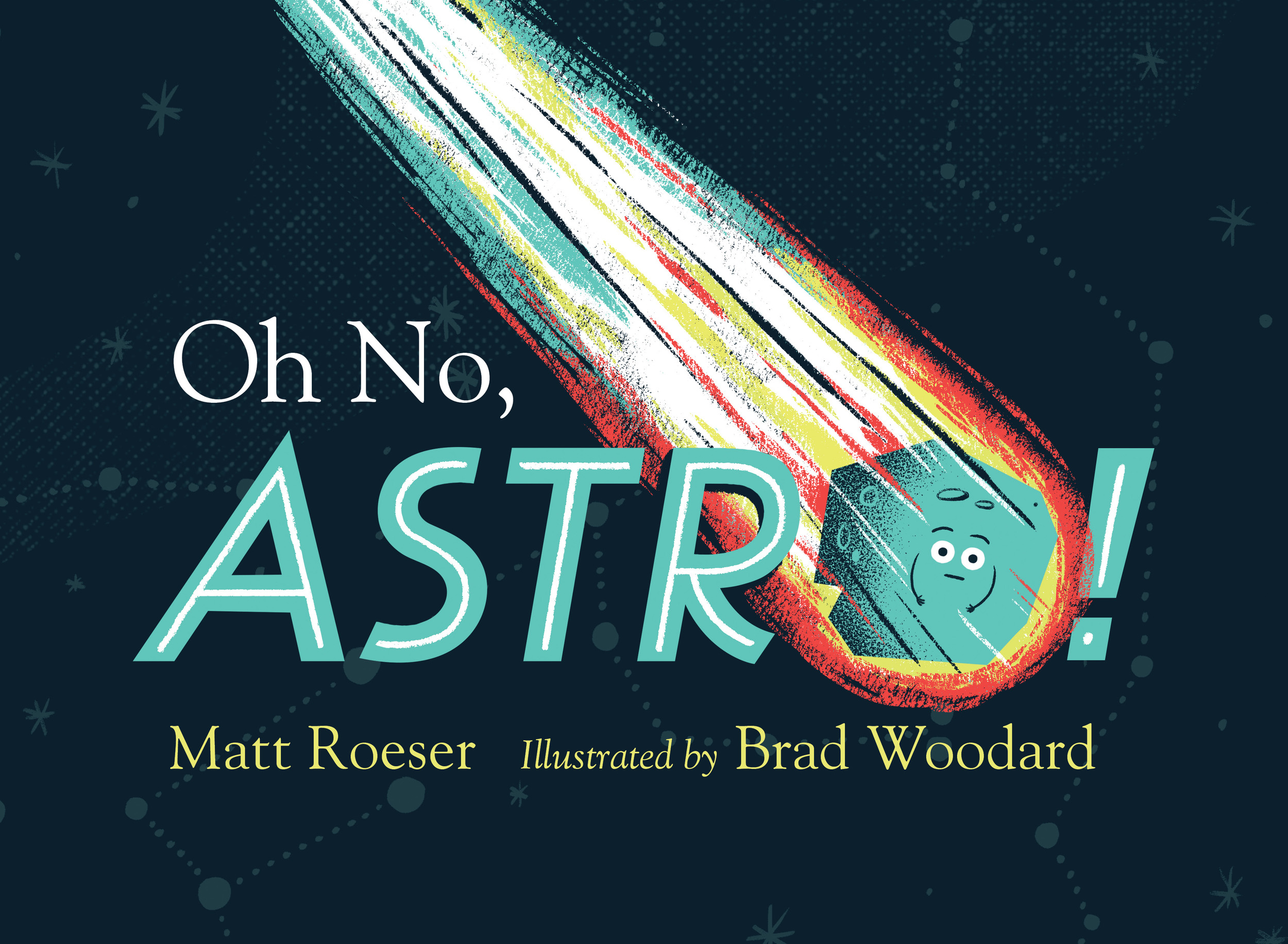
Who’s up for a road trip? I hope all of you because the three novels I’m editing for Winter 2019 all have one!
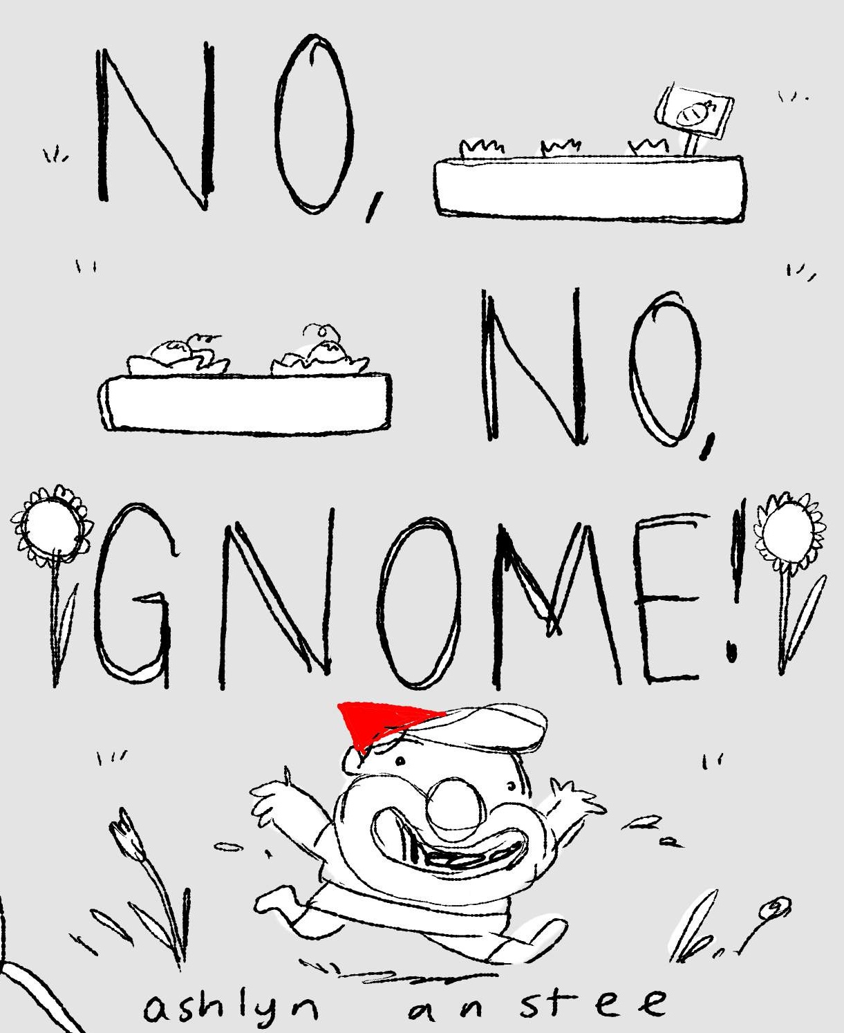
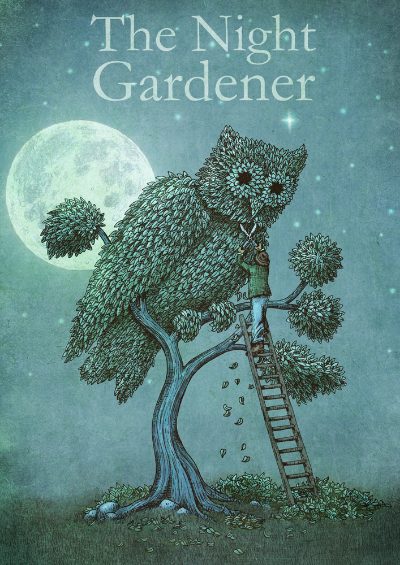
The Remarkable Journey of Coyote Sunrise (1/8/19) by Dan Gemeinhart has so many of the things I love about middle grade literature. An unforgettable protagonist in 12-year-old Coyote, a girl full of heart, wonder, and mischief. Honest, authentic issues in the form of the grief Coyote and her dad, Rodeo, deal with every day since the death of Coyote’s mom and two sisters. Genuine humor to offset the serious stuff, generated by the brilliant cast of characters Dan has created. And a journey of self-discovery, as this ragtag group drives from Florida to Washington State.
When designer Carol Ly and I met to talk about the cover, there was no doubt that we wanted to showcase Coyote. We also agreed that we wanted to do something sophisticated to go along with the heavier themes of the book. Carol hired Celia Krampien, who turned in some near-perfect sketches.

I love how evocative this image is, but it feels a bit quiet, which Dan’s book is not.

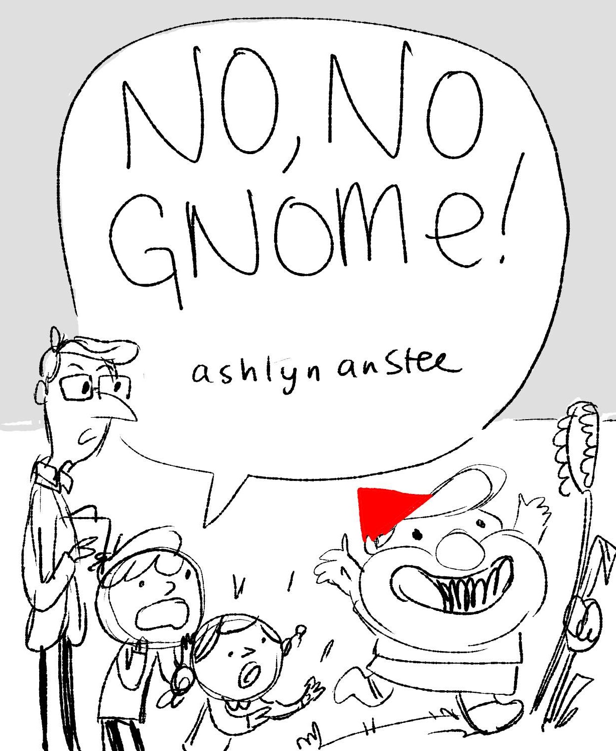
Celia’s composition here is super smart, and I love the movement in the sketch, but…

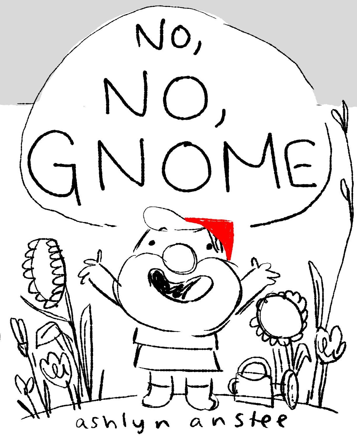
this sketch perfectly captures the energy of the character and the story.
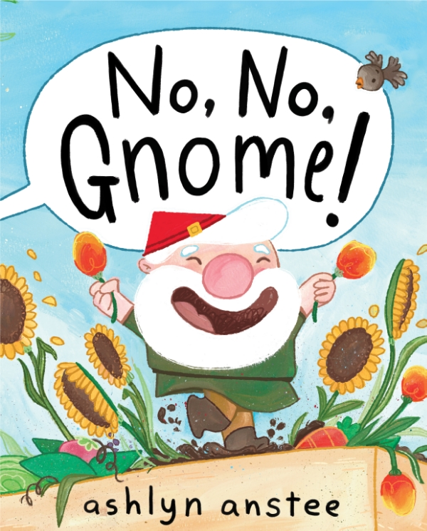
Celia went to final art on the third sketch, and after a title change, some experimentation with palette, and some fantastic hand lettering from Michael Burroughs, we had our final cover:

What We Buried by Kate Boorman (February 2019) is a tense psychological thriller that will make your mind expand and maybe even explode. I instantly fell in love with the novel’s damaged protagonists. Liv is sixteen and a former child beauty pageant queen and reality TV star. She’s coming to terms with the mental damage her childhood had on her and the role her parents played. Jory, her older brother, had a very different childhood. Born with a partial facial paralysis, he was relegated to the sidelines by his appearance-obsessed parents. The two have long been estranged, but circumstances force them to work together when their parents vanish. Their road trip through the deserts of Nevada is filled with surreal twists and nightmarish imagery, as the two grapple to reconcile their pasts and maintain a grip on the present. I’ve never read a YA novel that so deftly explores the bond between siblings.
Usually, when I acquire a novel, I can picture what the cover could be, but here, I was like, “Huh?” Happily, I was paired with designer Rich Deas, who is masterful at capturing tone and theme, particularly with complex, darker material. And just as he and I were starting to work together on the cover, the New York Times published a piece featuring a creepy AF piece of art by Matthieu Bourel. Rich brought Matthieu on board, who delivered some super cool comps.
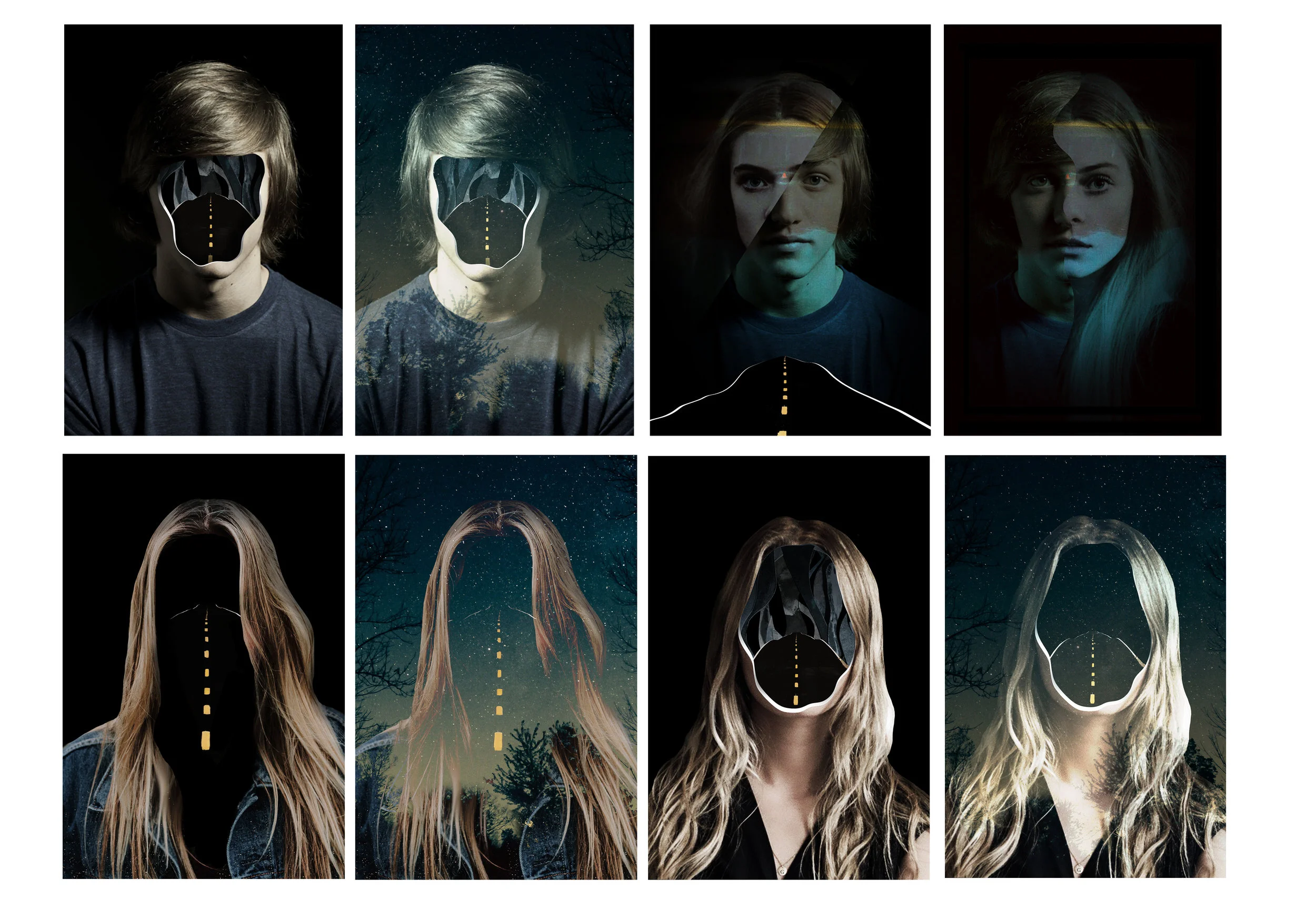
Rich and Matthieu worked closely to find the right model for Liv (Rich already had the perfect image for Jory) and the images that would live in the characters’ faces. Matthieu worked his magic, and then Rich played with backgrounds and type treatment.

As Liv and Jory’s narratives have equal weight in the novel, we wanted to give them equal “billing” on the jacket. I am IN LOVE with how it turned out.

Girls on the Verge by Sharon Biggs Waller (April 2019) is a coming-of-age story focused on the power of the friendship among three young women. Camille knows that she wants an abortion, and she quickly discovers how challenging the system in Texas makes it for young women. As she, Bea, and Annabelle drive from Houston to the Mexico border and then to New Mexico, she’ll share her experiences leading up to the road trip: of being ridiculed at a pharmacy, of being shamed at a family crisis center, of being bullied in court by a condescending judge.
The novel has clear nods to Thelma & Louise, and designer Katie Klimowicz and I discussed doing a photographic cover, maybe a selfie of our three heroines along the lines of this iconic image:

My mind also jumped to Crossroads, another tale about three young women on a road trip of discovery.

But the photographic approach felt potentially cheesy and would have necessitated a photo shoot (the stock photos weren’t going to cut it), which would have been hard to pull off—three models, a car, a road that looked like it was in Texas. Katie determined that the best path forward was to do something typographic, which felt right for Sharon’s awesome title and the content of the book. She brought on the brilliant Letterettes, and together, they came up with some polished concepts, including these:

We ultimately moved forward on Option 3, which best captures the narrative: the tire treads speak to the road trip, and the double pink line evokes a positive pregnancy test. The Letterettes worked their magic, resulting in this beautiful final cover.

Enjoy the rides! And please don’t text while driving.