Over the last couple of weeks, some lovely folks have revealed the covers of the books I'm editing with publication dates in Fall 2015. (See here, here, here, and here.) The titles and covers fed to accounts over the weekend (our first metadata feed for the season), which means they're all available for preorder. Yay for you!
I thought it'd be cool to give you, dear reader, a little insight as to how these covers came together.
Maid of Wonder by Jennifer McGowan is the third book in the glamorous, action-packed Maids of Honor series. It goes on sale on 25 August 2015.
Lucy Cummins had established a great look for the series with the paperback edition of Maid of Secrets, so there was no need to toss around a bunch of ideas. Instead, we could go straight into casting with the goal of finding a compelling young woman and a couple of hot guys. The lead character in Maid of Wonder, Sophia Dee, is the youngest of the Maids of Honor as well as a bit of an oddball--her gift of Sight has made her less socially graceful than her fellow maids. So Lucy and I needed to find someone youthful (all the models we meet are young, but many do not look youthful) with a vulnerable, ethereal quality, which this young woman totally had. In terms of the young men, we met a bunch of them (poor us, right?). The boys who made it to the cover had physical qualities that matched Sophia's suitors in the novel. They also happened to be fun to be around, which makes a shoot day all the more enjoyable.
Once casting was done, Lucy got to work sourcing costumes and props. There isn't a ton of quality Elizabethan garb available to the general public--the thought crossed my mind to call Sandy Powell and ask her what she did with the Shakespeare in Love costumes--but Lucy found some gorgeous pieces.
We shot the cover at Michael Frost's very cool studio in Manhattan near Union Square. (I've worked with him on a few occasions, and it's always a blast to be in his space.) Lucy then selected her favorite images, and she and I reviewed them together. After a little bit of Photoshop magic, she presented the finished cover. The actual jacket will have a fancy holographic foil on the title.

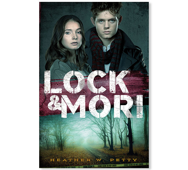
Lock & Mori, the first book in a new trilogy by Heather Petty, introduces us to a modern-day, sixteen-year-old Sherlock Holmes on the day he meets Miss James "Mori" Moriarty at their high school.
Though there has been a big shift in the industry toward illustrated covers for YA novels (a few years ago, this was not the case--publishers were encouraged to use photographs), our sense was that we needed to take pictures of actual humans for Lock & Mori. Krista Vossen devised a concept (if memory serves, she pitched just this one--it immediately felt right) and hired photographer Ylva Erevall. Next, we had the casting. I've been to a bunch of them at this point in my career, and I'll admit that they sometimes don't go very well. Not many models show up, or the ones who do don't look like the characters in the book. Or a model walks in, and you think, Yes, he's perfect! But then you discover he only has one expression and a leaden personality. Still, we must make a choice--a studio has been booked, hair and make-up hired, and costumes ordered, not to mention the in-house deadlines. But at the Lock & Mori casting, it was as if Catherine and Massey (the models we ended up hiring) had stepped out of the pages of the manuscript.
Ylva shot TONS of images, with the models in various poses and outfits; Krista has plenty to choose from for the next two books in the trilogy. The image on the bottom half of the cover (a stock photo) represents a key plot detail in Book One; Books Two and Three will follow suit.The final jacket is being printed on gritty stock with a metallic foil on the front cover.
Daniel Kraus is one of my favorite writers, so I was thrilled to beat out a bunch of other houses in the auction for The Death and Life of Zebulon Finch, Volumes 1 and 2. When it came time to talk about the cover for Book One, publishing on 27 October 2015, we knew we needed to go with an illustration...but of what? The novel spans five decades and two continents. There are dozens of characters. The book is a coming-of-age tale, it's historical fiction, it's gothic, it's literary, it's horror.
Thankfully, Lizzy Bromley had a plan. She came up with a list of illustrators whom she felt could capture the spirit of the book in a narrative way. One of those artists, the absolutely brilliant Ken Taylor, was intrigued by the novel's premise and signed on to the project. Lizzy and I provided him with a list of objects significant to Zebulon's story, as well as a little guidance on Zebulon's physical appearance--he took it from there. Ken's finished piece is one of the most intriguing, exciting, and cool illustrations I've ever seen for a book. Lizzy made it even more awesome with her excellent title treatment, color choices, and special effects.

Captive by A. J. Grainger, out on 11/3/15, is exactly what a thriller is meant to be: a fast-paced novel that keeps you guessing and is, most importantly, thrilling. In the book, the British Prime Minster's daughter has been kidnapped by terrorists. The story doesn't pull any punches, and designer Krista Vossen took inspiration from some of its dark and graphic scenes. She showed the group (at one of our bi-weekly meetings, in which designers and editors talk about covers) a number of images. This close-up of a girl blindfolded perfectly captured the tone of the book. Krista added some graininess to the image to create even more distance between our imperiled heroine and the reader. The finished jacket will have an extra shiny gloss to emulate a TV screen.

Check out the Coming Soon tab in the near future to learn more about these books.