As I did with my Fall 2015 list, I wanted to gather for you, dear reader, all of my gorgeous Spring 2016 covers in one place. And what a difference a list makes! For Fall 2015, I edited four fantastic young adult novels, which will start to hit bookshelves right before Labor Day. This season, I have just one YA book--Tommy Wallach's sophomore effort, Thanks for the Trouble. (In a post reminiscent of his cover reveal for We All Looked Up, Tommy took us step by step through the design process, sharing all of the cover concepts that didn't get selected.) My other three titles in Spring 2016 are picture books. For her cover reveal, Ashlyn Anstee sent a tweet that included the cover of her No, No, Gnome! Matt Roeser and Brad Woodard took to Facebook to show off the cover of their Oh No, Astro!, as did Terry Fan and Eric Fan with their The Night Gardener.
Let's take a look at how these four covers came together.
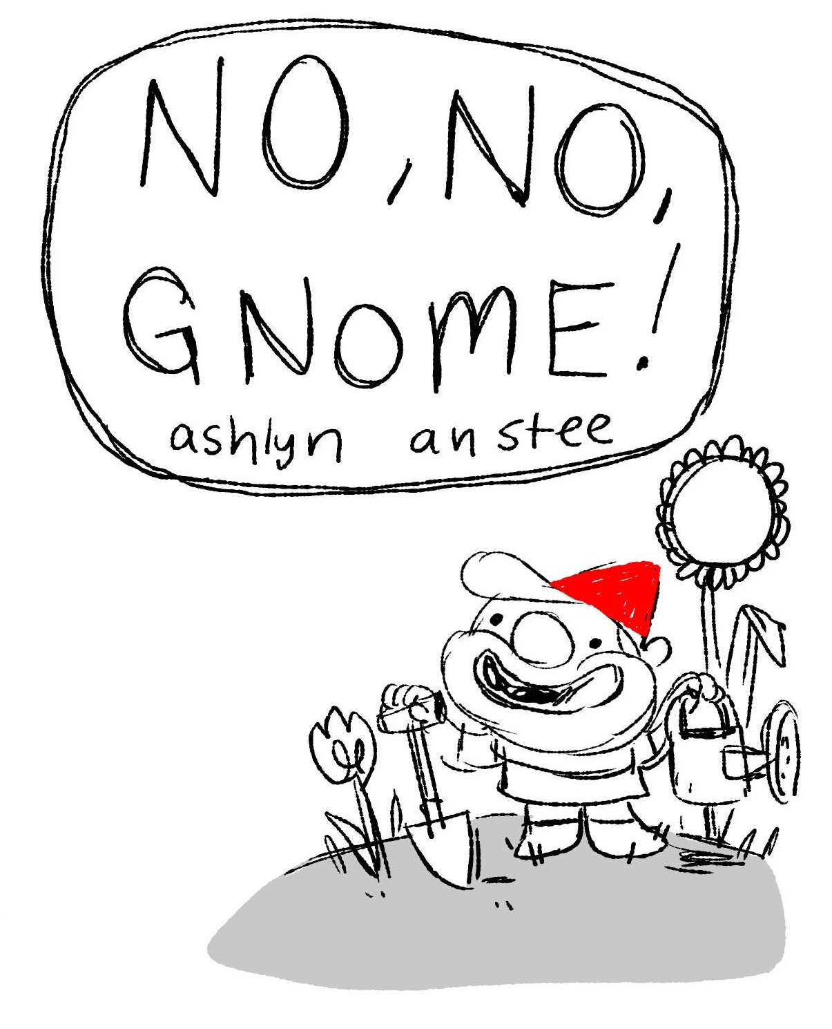
First up, we have No, No, Gnome! (2/9/16) by Ashlyn Anstee. Ashlyn's first book, Are We There, Yeti?, is on-sale 7/21/15, and I bought that title and an untitled picture book at auction from the wonderful Kelly Sonnack at Andrea Brown Literary. For her second book, Ashlyn pitched me a few stories, and I immediately fell for No, No, Gnome! I loved how the book's title and refrain were, yeti again, a play on words. (See what I did there?) I found Gnome ridiculously cute. And I really liked the school garden setting. So, Ashlyn got to work crafting the story of an energetic Gnome who wants nothing more than to help but whose eagerness sometimes gets the better of him.
Ashlyn is filled with ideas, and she delivered a bunch of options for the front cover. Like these...
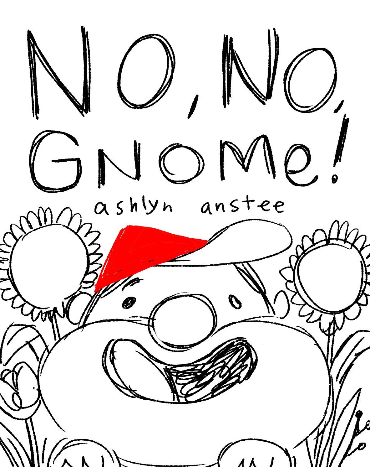
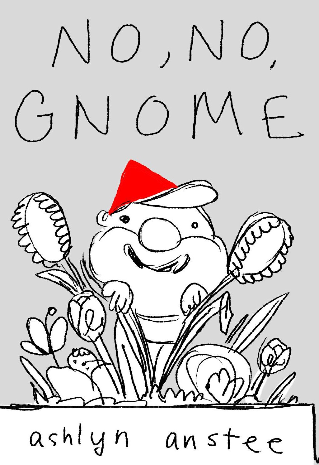
And these...
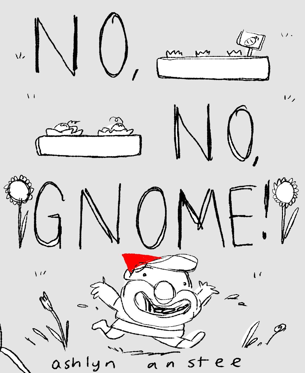
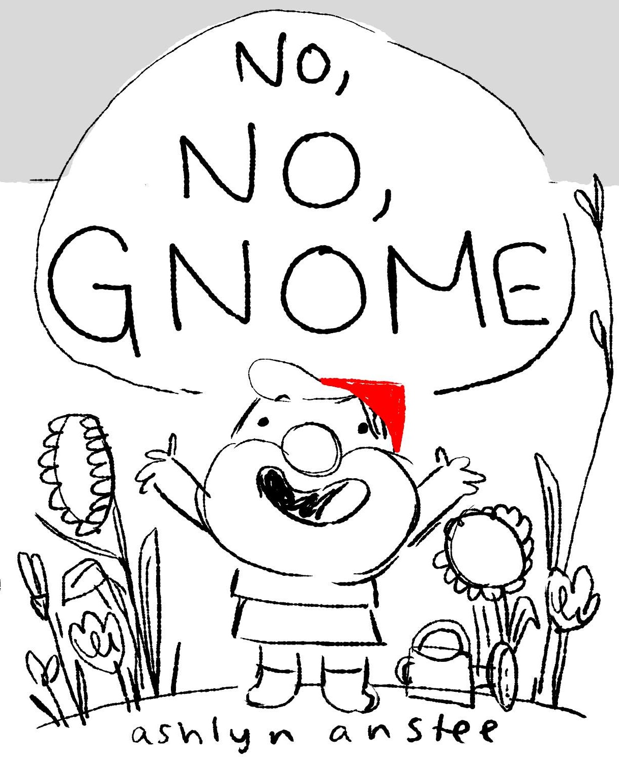
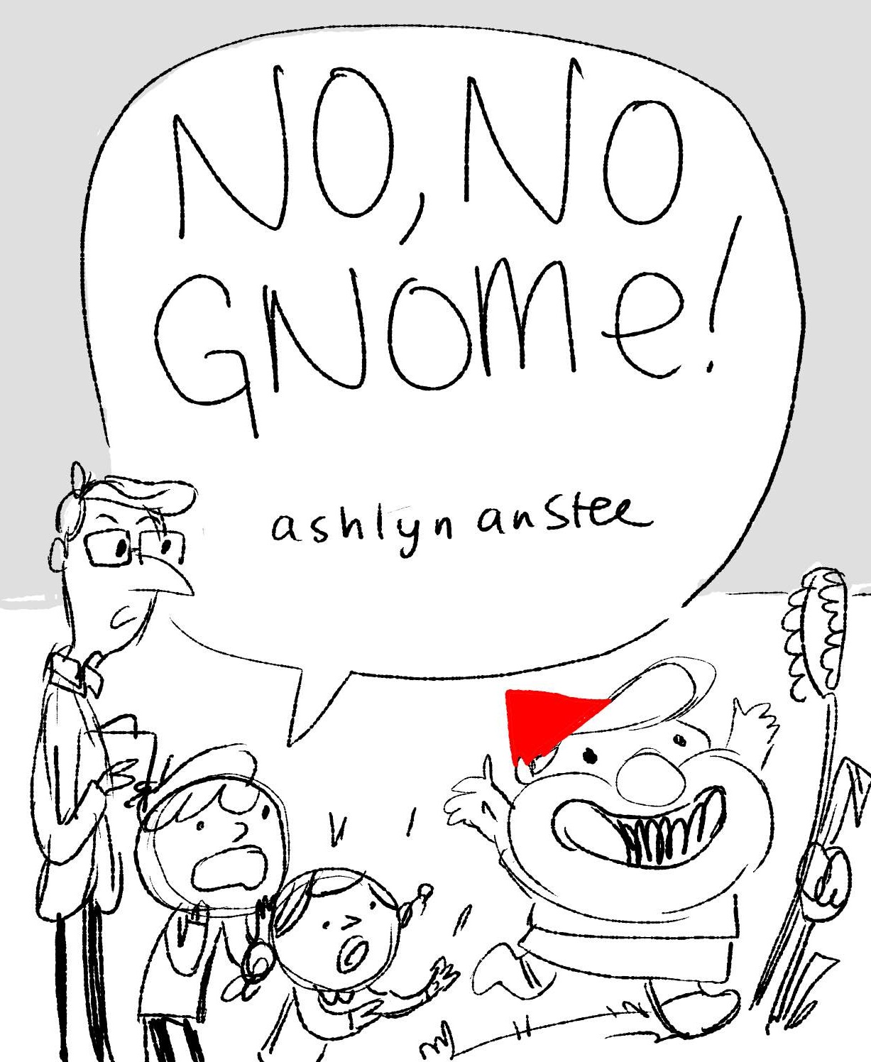
Chloe Foglia, the book's designer, and I discussed these options with "the group" (which includes the other editors and the other designers, along with my publisher). We really liked the composition of Number 3 (top right) and the title treatment of Number 6 (bottom right), which is reminiscent of what she did on Are We There, Yeti? Chloe asked Ashlyn to bring Gnome through the plants a bit more so that we could see his cute outfit (and not mistake him for someone else with a white beard and red hat). We also wanted a slightly more mischievous expression on Gnome's face. With those notes, Ashlyn went to final art and delivered...
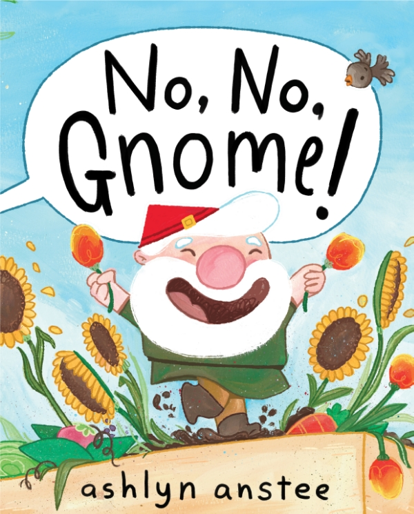
Like Are We There, Yeti?, the cover of No, No, Gnome! will be printed on uncoated stock with a spot gloss on the title and the author/illustrator's name.
The Night Gardener (on sale 2/23/16) began with this image (and two sample spreads).
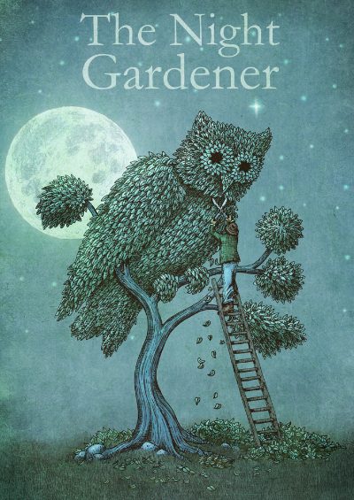
My gracious and thoughtful boss showed me the piece of art and asked if I saw any potential. If memory serves, I screamed, "Yes!" I felt like I was getting pulled into the Night Gardener's world, and I wanted to go to there. Terry Fan had just finished working on the gorgeous Rooftoppers by Katherine Rundell with designer Lizzy Bromley. He had enjoyed the experience so much that he reached out to her with this image of a topiary-loving gentleman to let her know that he and his brother, Eric, were eager to turn it into a picture book. Lizzy, the Brothers, and I got on the phone to talk about the character, the world he lived in, and the motivation for his clippings. We ended up with a truly magical story about a gray little town in need of some creative inspiration.
When it came time to talk about the cover, I think we all kind of knew that it would be a version of the Brothers' original idea. The story is told through the eyes of a young boy, so we brought him to the cover image. His wonder is ours.
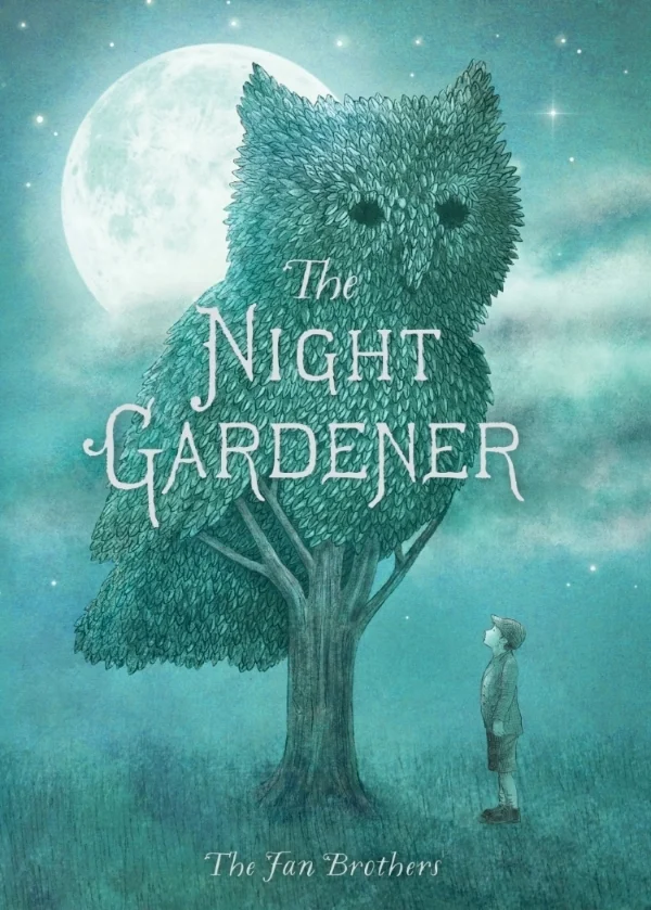
Lizzy is bringing so much magic to this jacket. It will be printed on a textured, uncoated stock, and the title will be a silver foil.
I half-expected designer Lucy Cummins to suggest a cover similar to We All Looked Up's for Tommy Wallach's second novel, Thanks for the Trouble. You know, another group of teens in a cool environment shot with some eye-catching technique. But while Lucy wanted to go photographic, she had a wildly different concept in mind--no people, just stuff. She was inspired by a scene relatively early in the book that takes place in a mall food court, and she had the perfect photographer in mind to capture the energy and tone of the novel: Keirnan Monaghan.
On the day of the shoot, I headed to Dumbo, where Keirnan has his studio. While he and his partner, Theo Vamvounakis, a brilliant props and sets designer, prepared, I took in the environment.
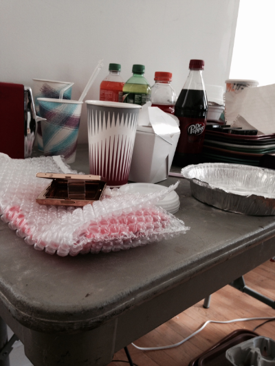
The props table
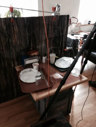
The set
I'll admit I was a little nervous. Everything looked kind of drab. I was having a hard time imagining how the title and byline were going to work with the image. But why do I ever doubt Lucy?

The magic of lighting changes everything.
(You'll notice that the above image does not have pizza. We needed pizza. Lucy rushed out to get some.)
Lucy considered having the title on loose scraps of paper (the protagonist communicates by writing on slips of paper) or scratched into the table. But neither approach was having the impact she wanted, so she went big and bold.

The finished jacket will be printed over metaltone with embossing and spot gloss on the title and byline.
Finally, I'm incredibly excited to be publishing Matt Roeser's first picture book. Matt is one of the most talented book designers in children's publishing. His manuscript for Oh No, Astro! (on sale 4/19/16) came to me via the ever-charming and gifted Tim Federle, and I jumped at the chance to edit it. "Manuscript" is a misnomer; what Matt delivered was a fully formed sketch dummy--and Matt's not even an illustrator. Utilizing art from this poster, Matt crafted his tale of a grumpy asteroid who takes an unexpected (and unwanted) journey through space. (Matt, of course, asked the poster artist, Brad Woodard, for permission to use the art. And we, of course, hired Brad to illustrate the book, because his artwork is awesome.)
This is the cover that Matt included with his submission:

And this is the final cover:
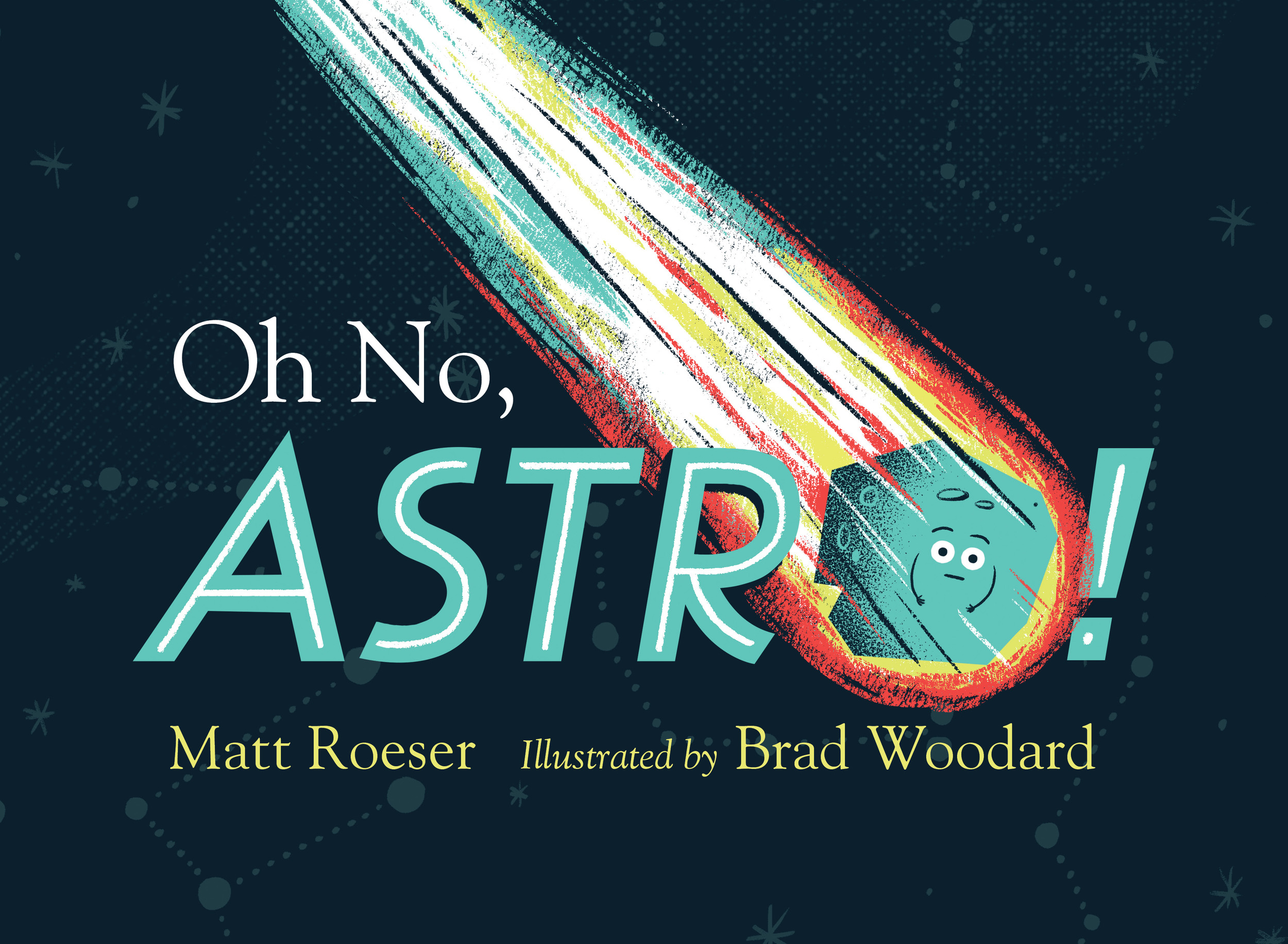
Matt's concept was genius, so we stuck with it. We decided to take Earth off the cover 1) to keep the ending more of a surprise and 2) to give us more room to make the title and Astro larger. The book's designer, Lizzy Bromley, selected a font that perfectly suits the retro-vibe of Brad's art. The jacket will be printed with a matte lamination. "Astro!" and Astro and part of his tail will have a spot gloss.
Check out the "Coming Soon" tab soon to learn more about these books!