It’s the hottest weekend of the year, and have I got some hot titles for you! (Forgive the crap writing—it really is hot, and my brain has melted.)
Last season, the three novels I edited all had road trips at the heart of their narratives. This season, there isn’t anything connecting the books (although I might be missing something; again, it’s very hot) other than that they’re gorgeous and brilliant and I love them.
Gabriel Alborozo was a house author-illustrator when I arrived at Holt, and I was excited and proud to work with him on Flora’s Tree House, a tale about siblings Flora and Will, their different styles of play, and how they come together on a carefree summer day. Flora likes using her imagination to write and draw stories, which she then puts in the titular tree house. We knew we wanted to feature the two characters and the tree house on the cover, while also hinting at the book’s imagination themes.
Gabe more than delivered on the final art, creating a verdant, lush image.

Gabe’s beautiful painting with his loose type
With just some minor adjustments and a bolder, easier-to-read title treatment, we had our cover.

Llama Destroys the World is exactly the kind of picture book I love working on—hilarious narrative with a memorable protagonist and bold, appealing art. We had two awesome and essential pieces to include on the cover: the (long) title and the (adorable) character. Illustrator Heather Fox, making her debut with this book, sent a number of sketches, like this one…

And this one…

April Ward, the book’s designer, ran with these directions and put together some comp covers with art from the interiors and Heather’s hand-lettering. We showed the following images to our sales team to get their input.
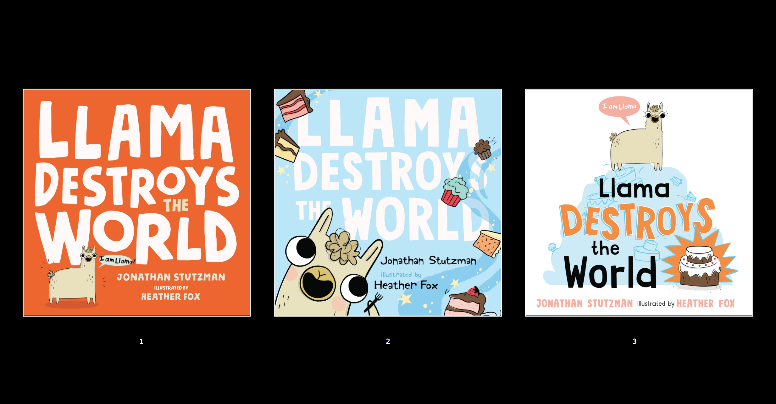
Though April, Heather, and I were all leaning toward Option 1—big title plus seemingly harmless, small character felt like comic gold to us—we knew that some of the accounts were favoring big characters on their covers. And it did come down to Options 1 and 2. Happily, Option 1 won out. We compromised by increasing the size of Llama by about 15%.

We finished the cover off with spot UV on the title and character, embossing on the character, and an insanely vibrant fifth color for the background.
One of the first books I worked on when I arrived at Holt was Jonathan Voss’s Brave Enough for Two. It’s a magical, sweet story starring two memorable characters—a little girl named Olive and her best friend Hoot, a stuffed animal—and I was excited to sign up a sequel, Imagine That. In it, Hoot has lost his imagination, and Olive has to help him find it. Patrick Collins (the book’s designer), Jonathan, and I knew we had to feature the characters on the cover, and we wanted to highlight the worlds Olive dreams up. Jonathan’s first effort looked like this:

Patrick and I loved the energy of the sketch, but we didn’t like that Hoot and Olive were pushed off to the side. And we were hopeful that we could set the title in the same place as we had on Brave Enough for Two. We went back to Jonathan with those notes, and we got this revision:

Everyone was beyond wowed with the composition, and so Jonathan, with the note to make the characters slightly larger, went to final art.

Make sure to take the jacket off the book—the case cover on it is stunning!
I worked on one novel for Spring/Summer 2019, the achingly awesome Scary Stories for Young Foxes by Christian McKay Heidicker, making his middle grade debut. Carol Ly, the book’s designer, and I brought on Junyi Wu to do the cover art and some interior illustrations. Junyi’s textured art felt perfectly suited to Christian’s creepy manuscript. Much like the fox kits at the heart of the novel, we want on a journey to get this cover right. First, Junyi sent some rough sketches:
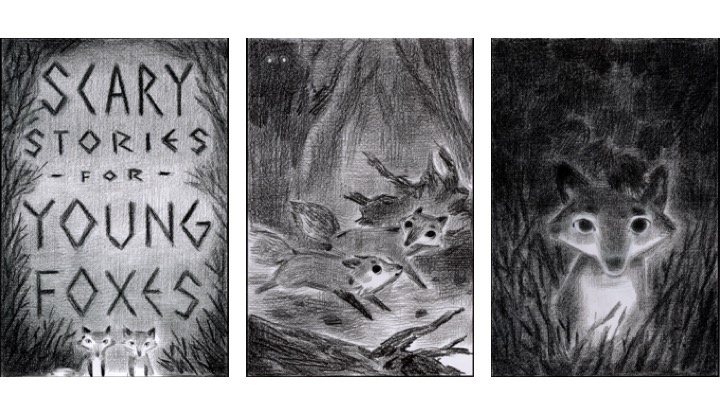
We liked the ideas, but Carol and I wanted more atmosphere and characters that felt more sinister. Round 2 looked like this:

Carol and I were feeling Options 1 and 2, so Carol crafted some gorgeous type for the title, and we presented the options to Sales.

The sales team slightly favored Option 1, so Carol went back to Junyi to have her do some color samples. She gave us a bunch; here are a few.

Carol and I liked how the color brought the setting to life, but we felt like something was getting lost—the cool or creepy factor, or both. We kept coming back to the black-and-white version with only our foxes colored, plus an all-red option that felt extra scary.

Ultimately, we loved the classic feel of the B & W version paired with Carol’s hand-lettering.

We printed the jacket on soft touch paper with spot gloss on the title and foxes. I LOVE IT SO MUCH!
Enjoy the reads!